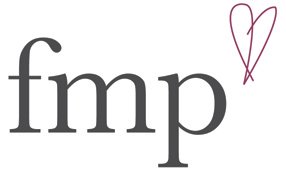
I got shortlisted in the competition for the Music in the Mountains logo brief, both designs were well recived. The one which features the heart was popular but the font wasn't well liked and the hand drawn style logo was also popular but they wanted more icons, so I thought to marry both ideas, as I am comfortable and happy with the heart logo I decided to make to heart less stiff, more fluid and european.
I am really pleased with the final outcome of the logo and it is universal and can be easily applied to a variety of medias as well as the application to a T-shirt like I 'heart' musica en las mountanas.
Subscribe to:
Post Comments (Atom)
Blog Archive
-
▼
2009
(100)
-
▼
March
(36)
- Devloping EOYS
- Creative Review Layout
- Pack Shot
- Dazed and Confused
- Liquid
- End of Year Show - Feedback
- ICM and Graphic Design Year 3
- Portfolio
- Signage
- Blue River
- Euro RSCG
- Mid Point Evaluation - 18th March
- JWT
- Peace, Land & Bread
- Progress Print
- BBC Radio Logos
- Photoshoot
- Progress Print
- Hovis Viral
- Australia Advert
- Araldite
- YPS Printers
- Norwich Union to Aviva
- Design Context Tutorial
- Final Logo Design
- ICM
- The Consult- Prospectus
- The Consult- 500
- Lloyds - Ambient
- Saatchi Saatchi
- London Ink
- Titan Outdoor Meeting
- Smart Idea
- Euston Broadside
- Guinness
- Euston Broadside Copywriting Competition
-
▼
March
(36)

No comments:
Post a Comment